Improving leads & deal management by redesigning sales portal
What I Did
Background
LastingSales is a CRM designed to streamline business operations by offering a centralized platform for managing leads from Facebook, your website, WhatsApp, SMS, and sales calls. It also distributes these leads to your sales team and allows for creating notes and actions to help close leads more efficiently.
Challenge
Despite the application being live and used daily by hundreds of customers, the lead-to-deal conversion time was significantly longer compared to market competitors. This inefficiency suggested that LastingSales was at risk of losing customers to competitors offering a better user experience and support.
I was asked to
Redesig the entire platform, including both web and mobile versions, and developed a robust and intuitive design system. This new system is designed to scale the product 10x faster in the future.
Conducting UX Audit (1/3)
I conducted a heuristic evaluation based on the Usability Heuristics Principles and a UX audit of the platform, and have shared the findings with the stakeholders. The evaluation identified the following key issues:
- Information Architecture: The organization and structure of content may be unclear or confusing, impacting how users navigate and find information on the platform.
- Aesthetic Issues: There are several design and visual elements that need improvement to enhance the overall look and feel of the platform.
- UX Flows: The user experience flows are not as intuitive as they could be, leading to potential confusion or inefficiencies in how users interact with the platform.
The findings from the heuristic evaluation and UX audit have provided valuable insights into the actual problems with the platform. Through this process, I observed that the core issues are primarily related to poor UX and numerous usability concerns. These issues contribute to a less effective user experience and highlight areas that need improvement to enhance overall usability and satisfaction.
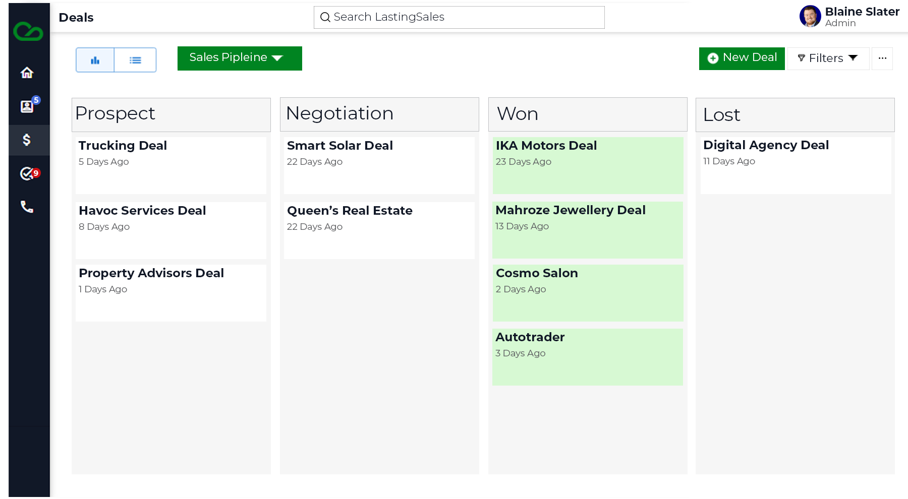
I found that a significant amount of information related to deals is missing. For example, there is a lack of visibility into how many deals are currently active, the representations assigned to each deal, and their respective stages. Additionally, it is unclear whether deals are progressing forward, getting stuck at certain points, or if there are options to perform bulk actions. Addressing these gaps will be crucial for improving the overall functionality and user experience.
Design the Solution (2/3)
Based on the identified issues, I propose the following actions to improve the UX:
- Enhance Information Visibility: Implement features to display the number of active deals, their current stages, and associated representations. This will provide users with clear and immediate insights into deal statuses.
- Improve Deal Progress Tracking: Develop mechanisms to show whether deals are progressing as expected or encountering obstacles. This can include visual indicators or status updates to help users easily understand deal flow.
- Enable Bulk Actions: Introduce functionality that allows users to perform bulk actions on deals, such as updating statuses or managing multiple deals simultaneously. This will streamline user workflows and improve efficiency.
- Revise Information Architecture: Restructure the platform’s layout to ensure that essential deal-related information is easily accessible and logically organized, addressing any gaps in the current information architecture.
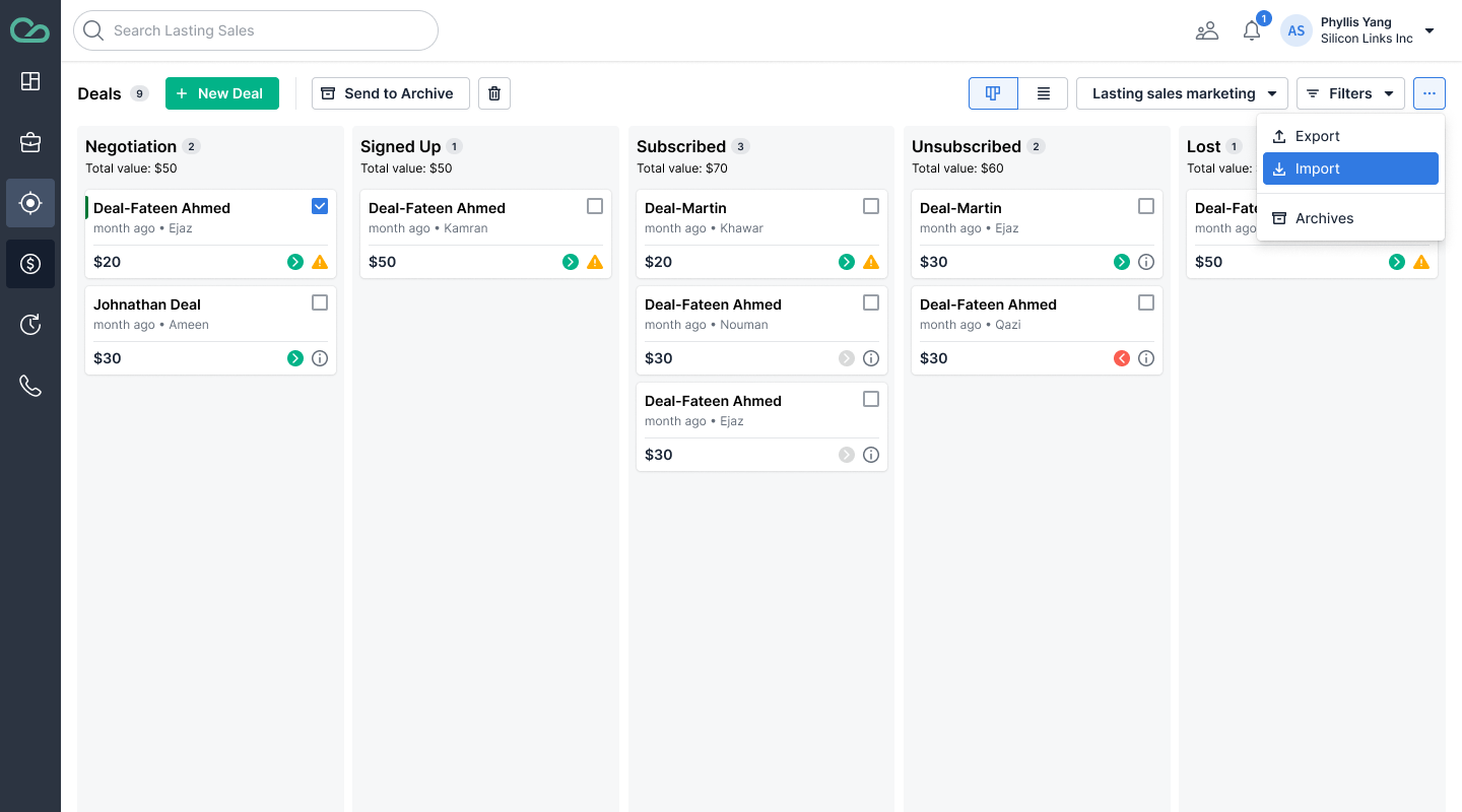
Deals Implement features to display the number of active deals, their current stages, and associated representations.
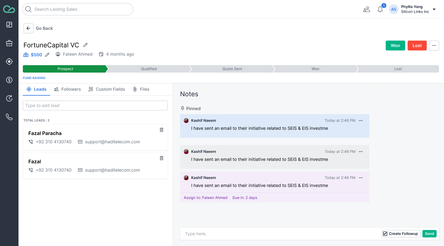
Detail DetailsMechanisms to show deal progress
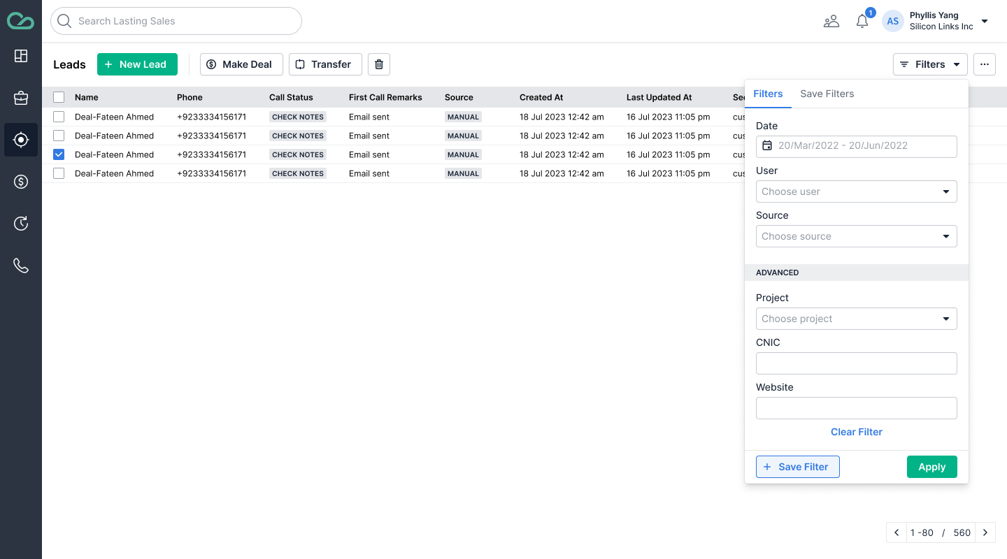
Filter Easy to navigate the filter section
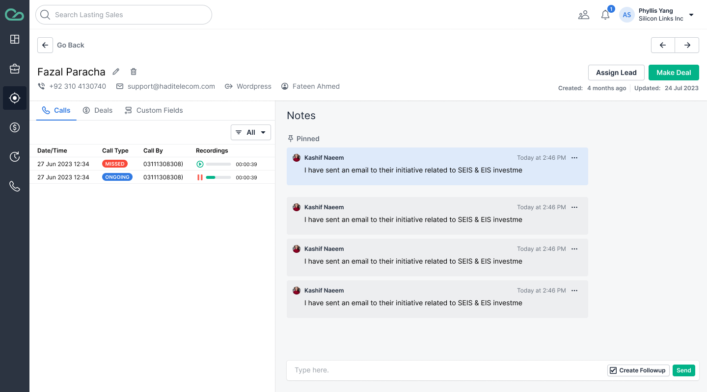
Leads Implement chat based notes capturing feature, which also facilitate the user to mark follow-up to particular note
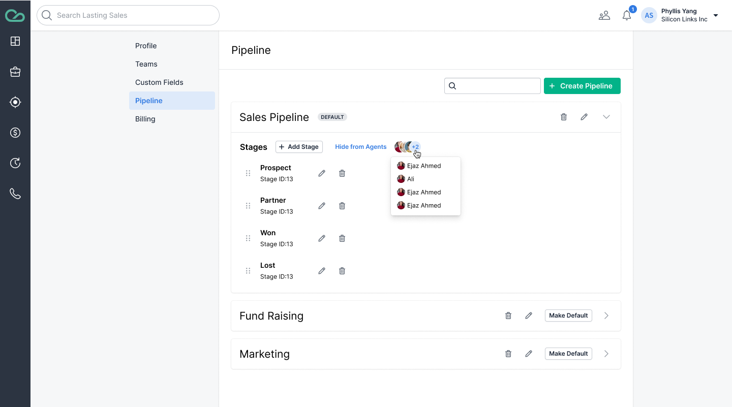
Settings User can manage his profile, pipeline, custom fields and view billing information
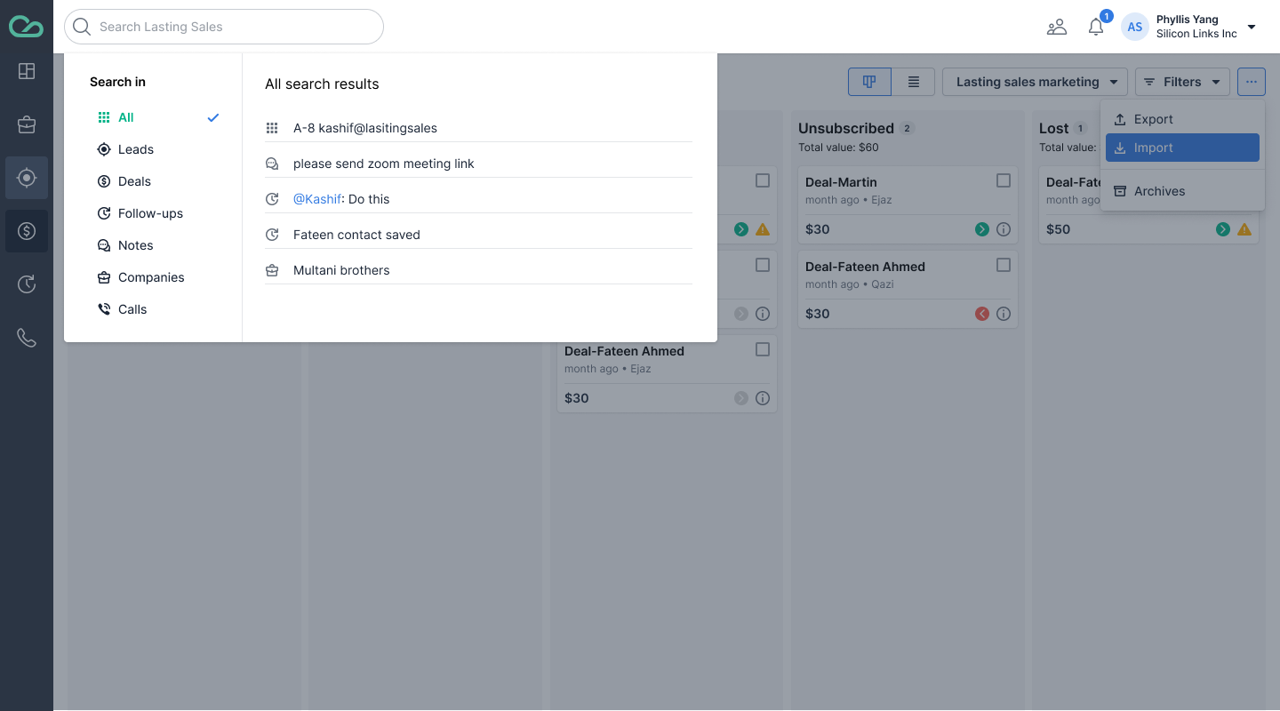
Search Intuative search for the entire platform
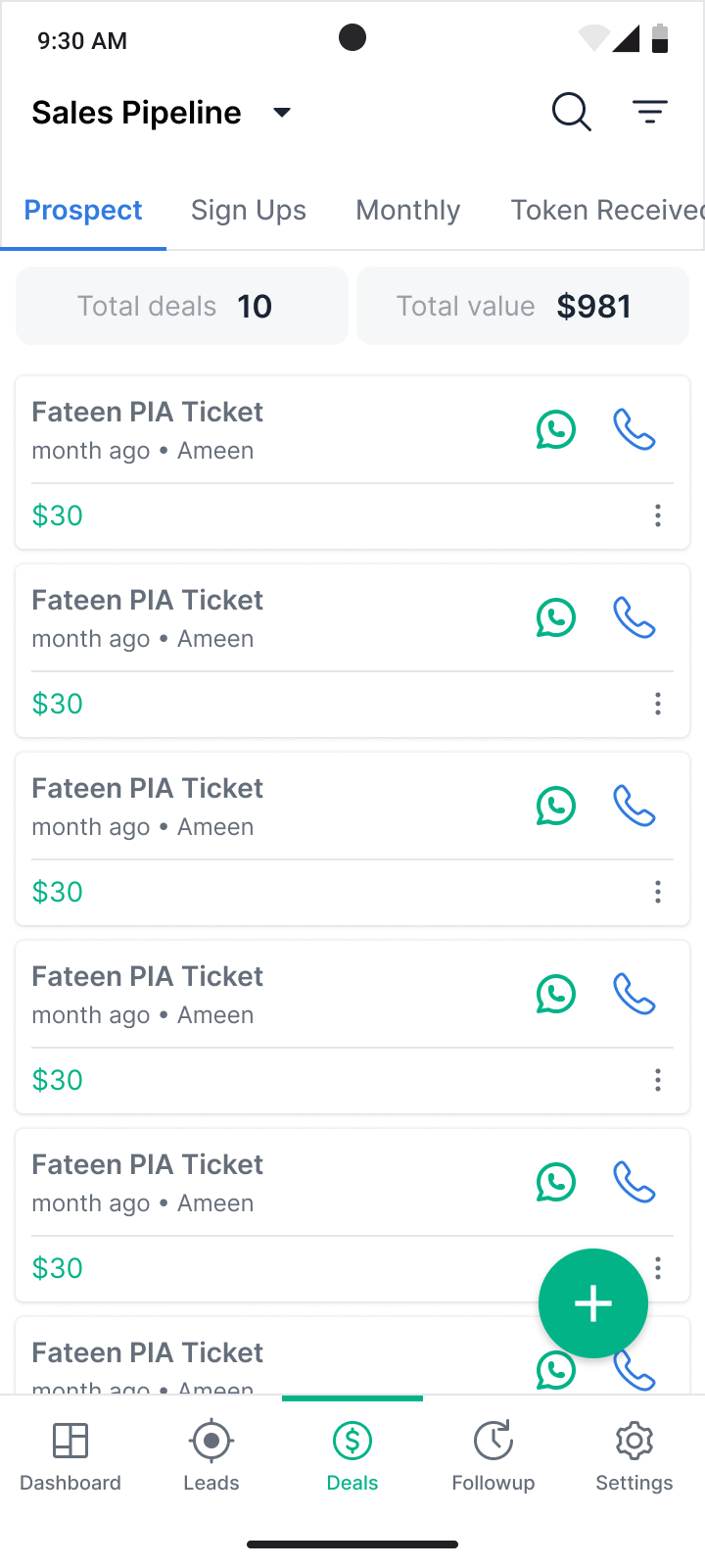
Deal listing screen with proper indication of total no of deals, deal value. Deals display according to their statu in the tabs
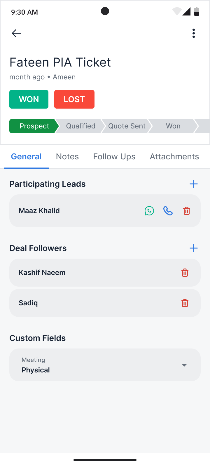
Deal detail screen with their current stage. User can add followers and custom fields
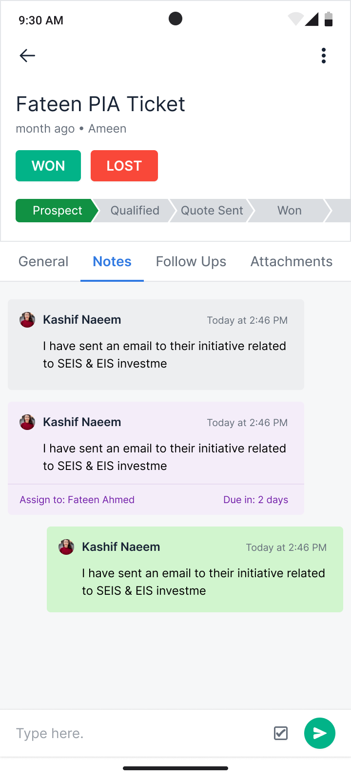
Deal notes tab where user can leave notes and add follo-ups notes with in their team
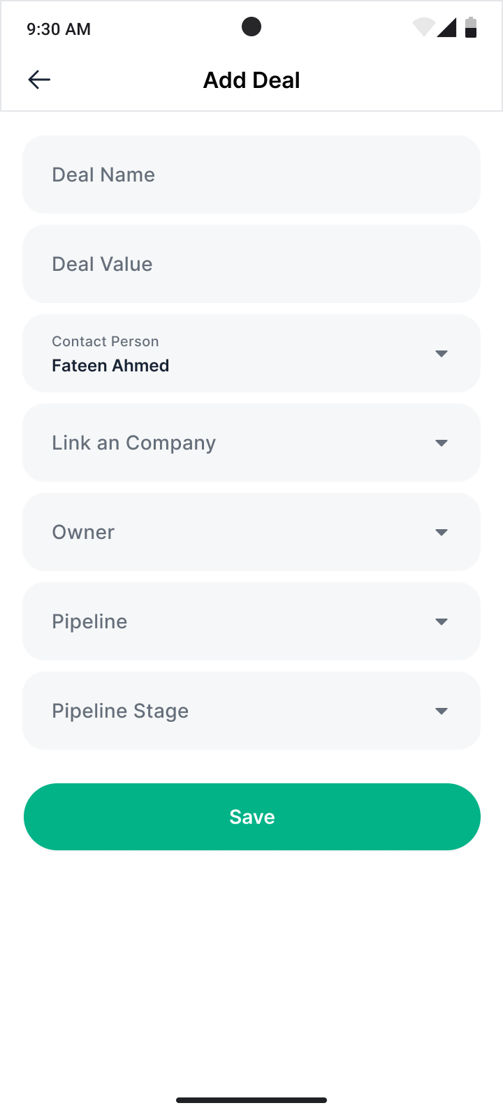
Add Deal
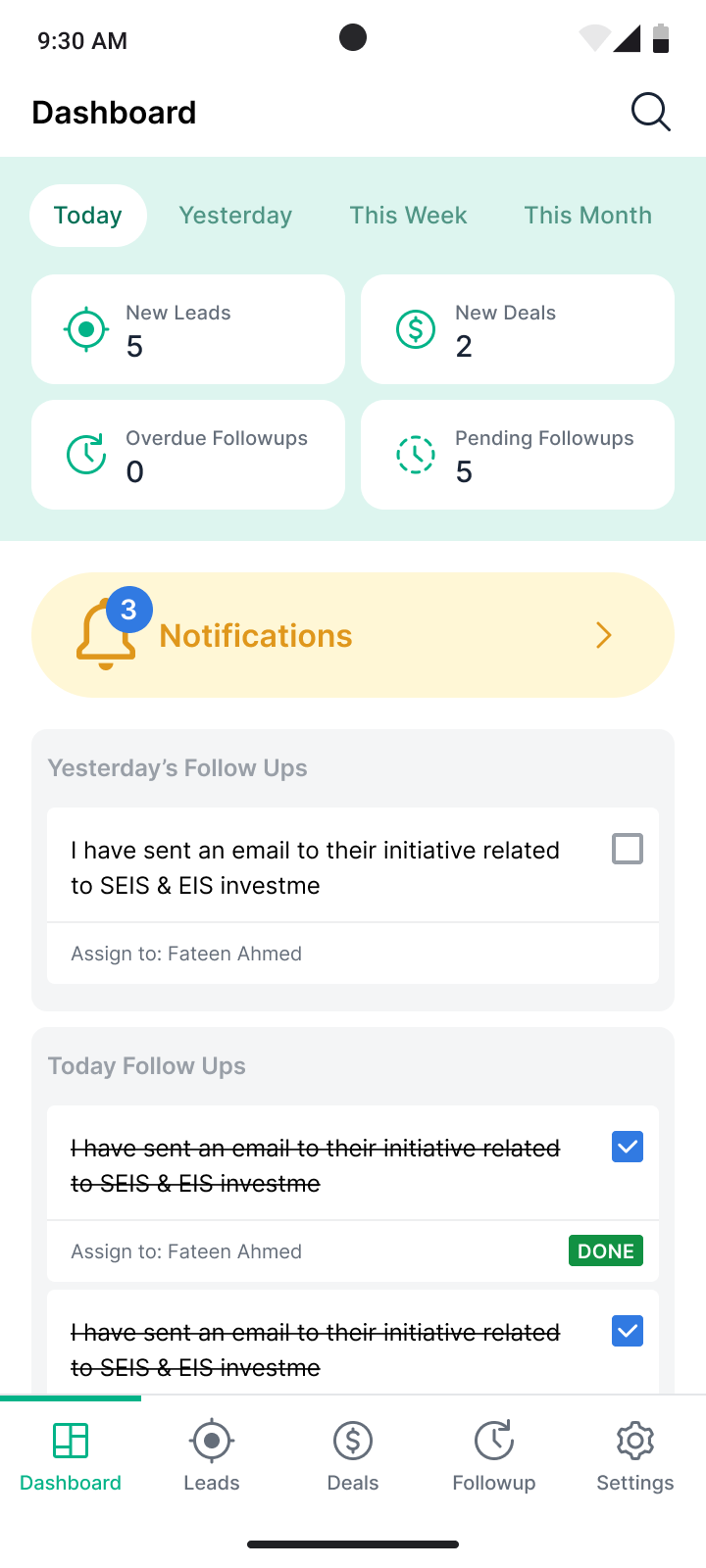
Dashboard with clear information of new leads and deals, Notificaton and followup section
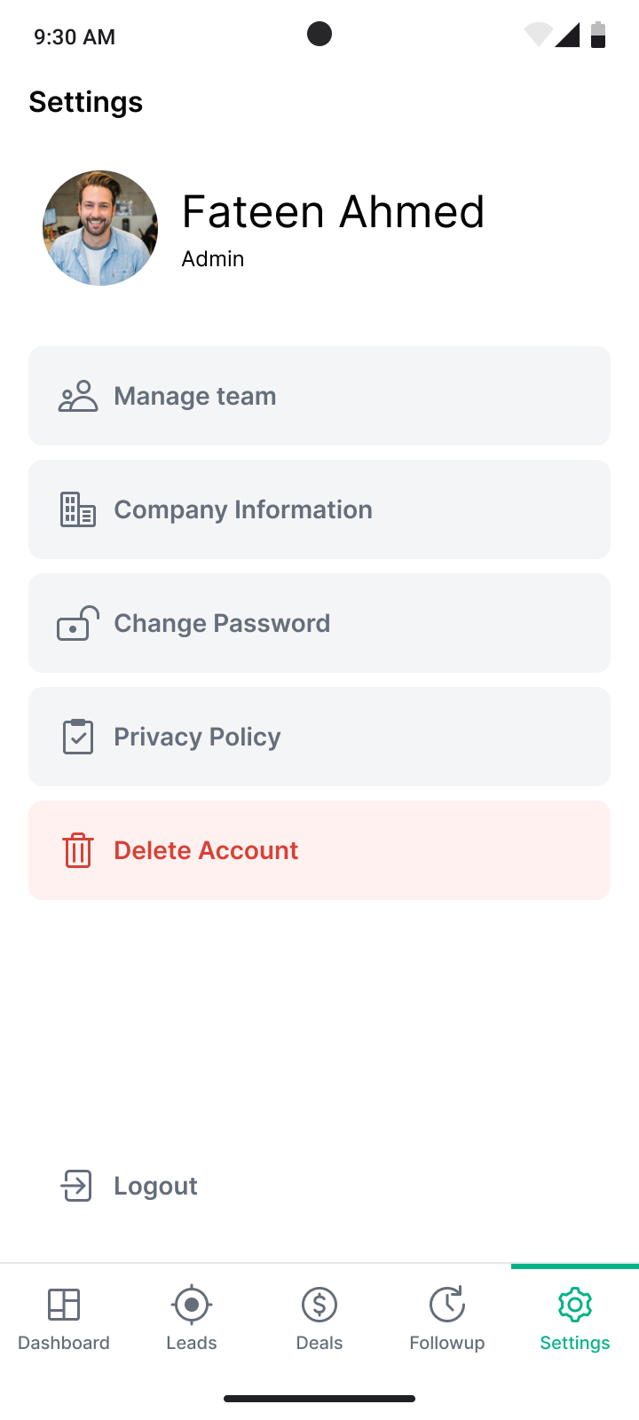
Setting User able manage his team, profile/company information
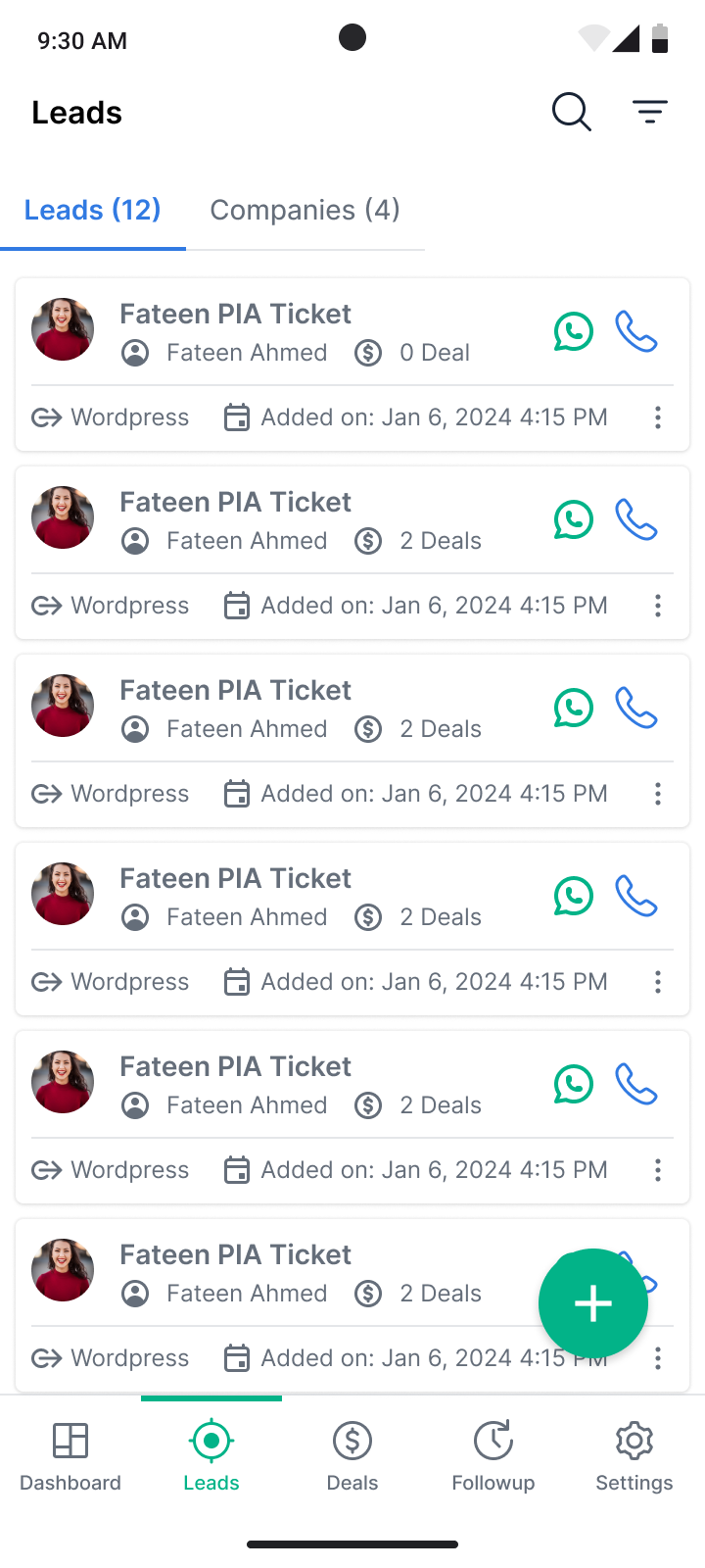
Leads Proper identification of the source of the lead, creation and actions items to perfrom
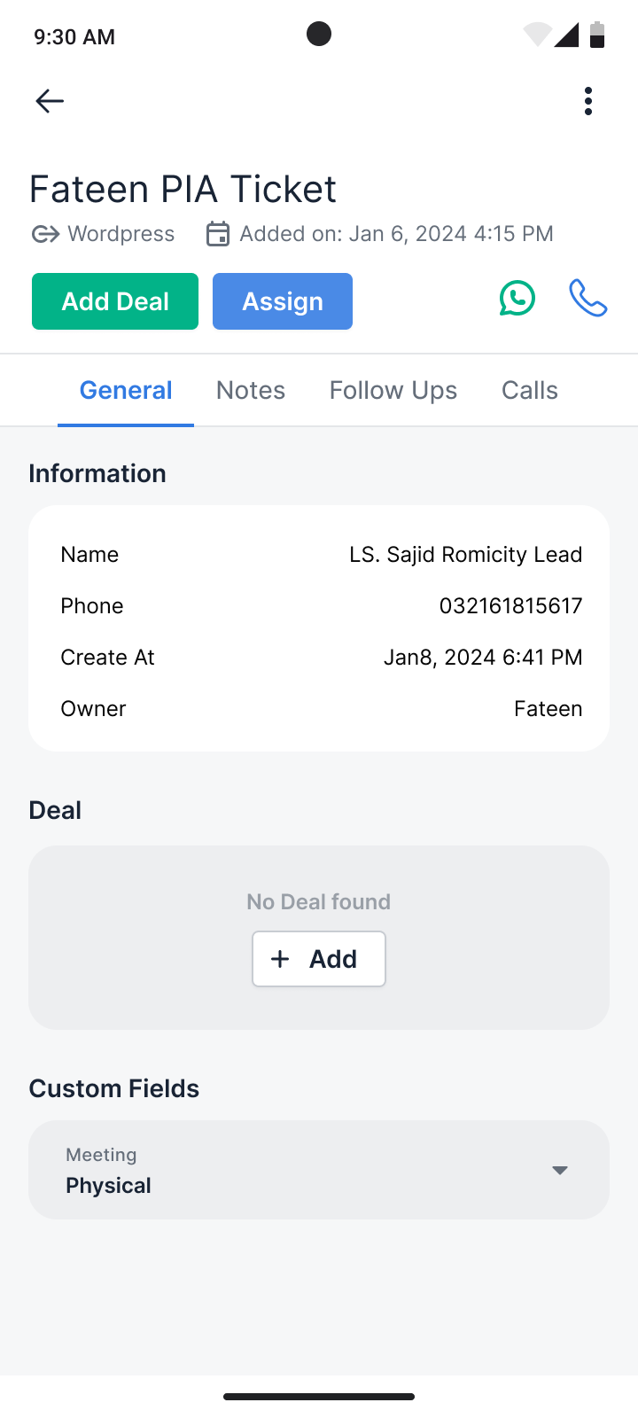
Lead Detail screen for the lead details with improve architecture
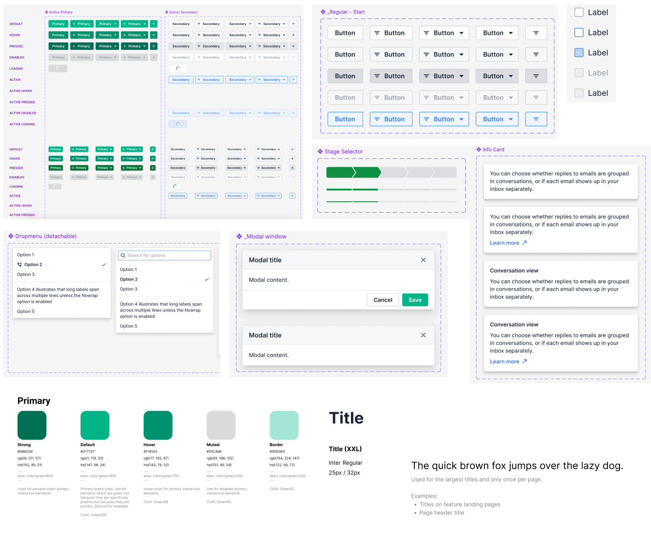
Design System the ultimate toolkit for crafting stunning screens with ease. Built on a solid foundation of cohesive colors, typography, and icons, it empowers designers to seamlessly create and customize components. Streamline the workflow and ensure consistency across the product
Developer Handoff (3/3)
I finalized the design and gave the engineering team 3 deliverables
- A comprehensive set of screens covering various user journeys and all possible states, designed using Figma.
- An interactive prototype for different user journeys to help them understand the flow (tool used: Figma)
- A design specification document detailing the updated architecture and information design of the feature.
